
If you would like to purchase a new WordPress theme, you should know in and out about the theme. The phrase ‘responsive WordPress theme‘ has been used in the recent past. Hence, you should know about the same so that you can make the most of your investment.
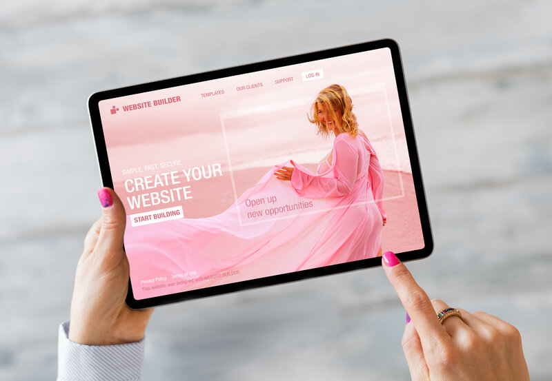
What is responsive design?
When you implement responsive design, the website’s layout will be in tune with users’ requirements. If you install a WordPress theme, it should have the capability to use CSS and JavaScript as per your needs. There will be a consistent user experience when you resort to responsive design.
In spite of the change in the browser, the appearance and functionality will not change. Thus, users will be able to view content in various kinds of browsers and on several types of gadgets, including smartphones, tablets, and PC. When you come across ‘responsive design, it is not only the website’s adaptability to a mobile platform but also the fulfillment of various factors in a very efficient manner. Users will be able to access content very easily. They are not required to zoom or scroll as per their needs. The content will be served in an intuitive way, and it will be served automatically.
Benefits of Responsive Themes
When you opt for a responsive theme, the updates can be done very easily as per the latest needs of users. The number of sales that are happening through mobile phones is increasing at a great pace. It is possible to present focused content. The compatibility across various platforms can be checked. The whole process can be managed very easily. Responsive themes are cost-effective. They are SEO-friendly so that the traffic on the site can be enhanced without any issues.
The content and the layout will respond to the screen. When you choose a responsive design, the site will easily fit into the screen’s needs. Responsive design aims to deliver the best possible display in all kinds of screens.
Go for the Best!
In order to figure out the best responsive themes, you can navigate through Google Chrome’s web developer extension. Responsive use can be tested very efficiently. The quality, as well as speed, can be checked without any issues. You can also check the behavior of the theme on various browsers and operating systems.
There are many responsive themes. However, the majority of them are available at a price. If you would like to deploy the best possible theme, you should go for premium versions. Regardless of the price, the theme should be evaluated for your needs. If you are aware of the procedure to test various themes, you can settle for the best theme without any issues. There are online tools such as Adobe BrowserLab, Browsershots, and Browser Sandbox which can be used for testing. It would be best if you verified the menu handling as well as video handling as per your needs. You can go for video-embedded responsive design as per your needs.